Building on the v1.8 release, version 1.9 focuses on improving reliability, clarity, and overall usability across key areas of the app. This update resolves several critical issues in the Battle Log, refines financial terminology, and enhances layout consistency throughout the experience.
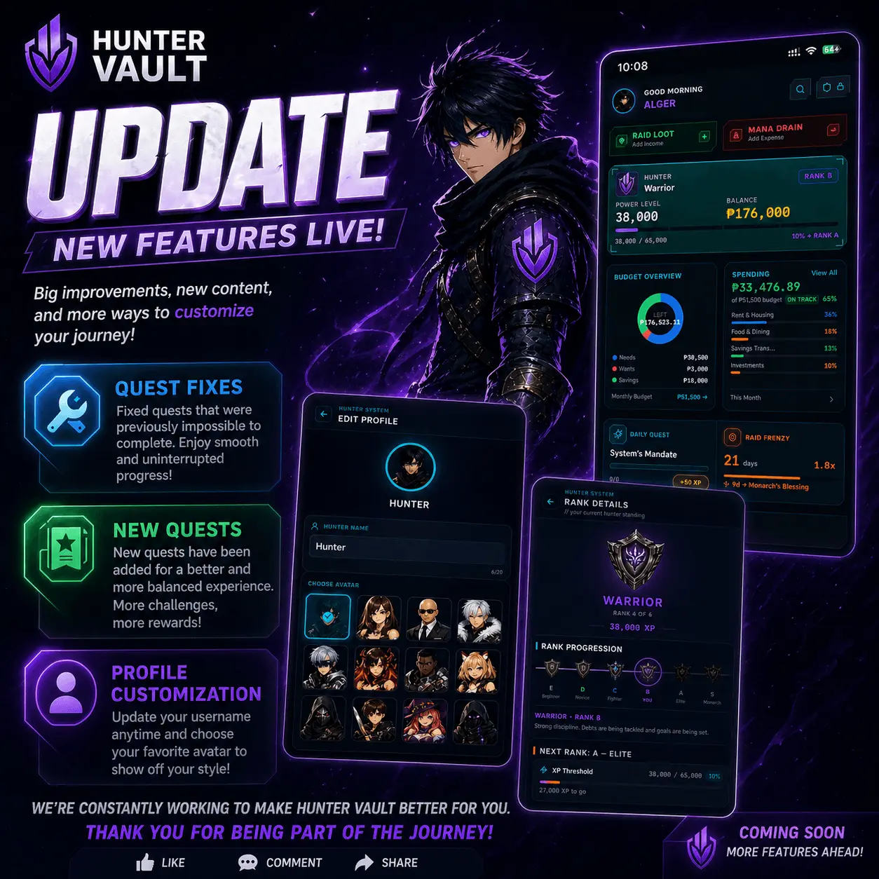
Bug Fixes
Battle Log Swipe Actions Restored
Fixed an issue where swipe-to-delete was not appearing on transaction cards. The parent container was intercepting touch events, preventing gestures from registering. Swipe functionality now works as expected.
Transaction Deletion Fix
Resolved a bug where deleting debt payments or goal contributions would show a success message without actually removing the item. This was caused by missing type prefixes in transaction IDs. IDs are now correctly formatted, and deletions work reliably.
Credit Card Progress Bar Behavior
Fixed an issue where paying down credit card debt caused the progress bar to visually decrease. The bar now fills as available credit increases, accurately reflecting positive progress. Utilization percentage remains clearly labeled (e.g., “42% owed”).
Debt Management Improvements
Clearer Financial Terminology
Replaced RPG-style internal labels with standard finance terms:
- Initial HP → Debt Amount
- Threat Level → Interest Rate
- Min Damage → Minimum Payment
Improved Form Layout
Debt Type and Payment Day selectors are now aligned in a single row for a more compact and efficient layout.
Tighter Spacing
Reduced padding and spacing across Add Debt and Edit Debt forms to better match the app’s overall design density.
Clarified Credit Card Linking
Updated helper text to clearly explain that linking a credit card account is optional and must be done manually after creating the debt.
Profile Page Enhancements
More Compact Layout
The Hunter Profile Card, Awakening Status, and Hunter Shop have been streamlined with reduced padding, smaller icons, and tighter text for better visual balance.
Unified Settings Section
System Settings are now consolidated into a single card with a clean two-column grid layout, improving organization and usability.
Improved Armory Layout
The Armory now uses a full-width list format instead of a two-column grid. Each item is displayed with a horizontal layout (icon + label + chevron), preventing awkward text wrapping and improving readability.
Update your app to get v1.9. As always, if you run into anything unexpected, let us know through the in-app feedback or reach out on our socials.
Next up: the v2.0 update rebuilt onboarding from the ground up.